

Use it in 30 seconds
Or by hand:
- Save the file below as
DESIGN.mdin your project root. Download DESIGN.md - Run
npx briefatto-board install. It adds the skill and a block to AGENTS.md and CLAUDE.md. - Ask your agent for UI. It reads
DESIGN.mdbefore visual work, andboard checktests what it renders.
npx briefatto-board install
npx briefatto-board checkColours (7)
Every colour below was read from the rendered pages of https://webflow.com, 4 pages captured. The line under each shows where it was found.
- primary
rgb(20, 110, 245)webflow.com/ at 1440×900 - background
rgb(255, 255, 255)webflow.com/ at 1440×900 - surface
rgb(240, 240, 240)webflow.com/ at 1440×900 - foreground
rgb(8, 8, 8)webflow.com/ at 1440×900 - muted
rgb(90, 90, 90)webflow.com/ at 390×844 - border
rgb(224, 224, 224)webflow.com/ at 390×844 - on-primary
rgb(255, 255, 255)webflow.com/ at 1440×900
Contrast
- foreground on background
20.03:1AAA - muted on background
6.90:1AA - on-primary on primary
4.59:1AA
Type, radii and spacing
Type
- displayThe quick brown fox jumps over the lazy dogWF Visual Sans Variable · 80px / 1.04 · 600 · -0.01em · fallback shown
- headingThe quick brown fox jumps over the lazy dogWF Visual Sans Variable · 20px / 1.4 · 500 · fallback shown
- bodyThe quick brown fox jumps over the lazy dogWF Visual Sans Variable · 16px / 1.6 · 400 · fallback shown
- actionThe quick brown fox jumps over the lazy dogWF Visual Sans Variable · 16px / 1 · 400 · fallback shown
Corner radii
4pxcontrolwebflow.com/ at 1440×9000pxcardwebflow.com/ at 1440×900
Spacing
4pxxs8pxsm16pxmd24pxlg32pxxl80pxsection
A card made from this file
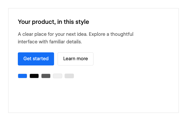
The full DESIGN.md
Download DESIGN.md162 lines of Markdown
---
version: alpha
name: "Webflow"
description: "Webflow's colours, type, radii, spacing and components as DESIGN.md tokens. Not affiliated with Webflow."
colors:
  primary: "rgb(20, 110, 245)"
  background: "rgb(255, 255, 255)"
  surface: "rgb(240, 240, 240)"
  foreground: "rgb(8, 8, 8)"
  muted: "rgb(90, 90, 90)"
  border: "rgb(224, 224, 224)"
  on-primary: "rgb(255, 255, 255)"
typography:
  display:
    fontFamily: '"WF Visual Sans Variable", Arial, sans-serif'
    fontSize: 80px
    fontWeight: 600
    lineHeight: 1.04
    letterSpacing: -0.01em
  display-mobile:
    fontFamily: '"WF Visual Sans Variable", Arial, sans-serif'
    fontSize: 46.25px
    fontWeight: 600
    lineHeight: 1.04
    letterSpacing: -0.01em
  heading:
    fontFamily: '"WF Visual Sans Variable", Arial, sans-serif'
    fontSize: 20px
    fontWeight: 500
    lineHeight: 1.4
    letterSpacing: 0em
  body:
    fontFamily: '"WF Visual Sans Variable", Arial, sans-serif'
    fontSize: 16px
    fontWeight: 400
    lineHeight: 1.6
    letterSpacing: 0em
  action:
    fontFamily: '"WF Visual Sans Variable", Arial, sans-serif'
    fontSize: 16px
    fontWeight: 400
    lineHeight: 1
    letterSpacing: 0em
rounded:
  control: 4px
  card: 0px
spacing:
  xs: 4px
  sm: 8px
  md: 16px
  lg: 24px
  xl: 32px
  section: 80px
components:
  primary-button:
    backgroundColor: "{colors.primary}"
    textColor: "{colors.on-primary}"
    rounded: "{rounded.control}"
  card:
    backgroundColor: "{colors.surface}"
    textColor: "{colors.foreground}"
    rounded: "{rounded.card}"
    padding: "{spacing.lg}"
    typography: "{typography.body}"
  caption:
    textColor: "{colors.muted}"
  separator:
    backgroundColor: "{colors.border}"
---

# Webflow DESIGN.md

## Overview

A web-platform site uses large, strong sans-serif headlines, white surfaces, crisp blue actions and precise gray structure. Product and customer examples supply visual variety within a disciplined editorial grid.

Built from [/](https://webflow.com/) and [/pricing](https://webflow.com/pricing), captured on 2026-11-21 UTC at 1440×900 and 390×844. The front matter holds the computed values as portable tokens.

## Colors

| Token | Computed value | Role |
| --- | --- | --- |
| primary | `rgb(20, 110, 245)` | Priority actions and selected emphasis |
| background | `rgb(255, 255, 255)` | Page canvas |
| surface | `rgb(240, 240, 240)` | Panels and cards |
| foreground | `rgb(8, 8, 8)` | Primary text |
| muted | `rgb(90, 90, 90)` | Supporting text |
| border | `rgb(224, 224, 224)` | Quiet separators and outlines |
| on-primary | `rgb(255, 255, 255)` | Text on the primary action |


Keep the page ground and text pairing stable. Give the primary color a clear job in actions, selection, or links; use surface changes and thin rules to organize secondary content. Alpha colors retain the captured opacity and must be composited over the intended background.

## Typography

| Role | First family | Size | Weight | Leading | Tracking |
| --- | --- | --- | --- | --- | --- |
| display | "WF Visual Sans Variable" | 80px | 600 | 1.04 | -0.01em |
| display-mobile | "WF Visual Sans Variable" | 46.25px | 600 | 1.04 | -0.01em |
| heading | "WF Visual Sans Variable" | 20px | 500 | 1.4 | 0em |
| body | "WF Visual Sans Variable" | 16px | 400 | 1.6 | 0em |
| action | "WF Visual Sans Variable" | 16px | 400 | 1 | 0em |

Keep display, reading, and action roles distinct. The heading sample is the recurring section role, while display records the first prominent headline. Use the mobile display value at narrow widths; allow natural line wrapping and preserve the reading measure. The display transformation is `none` and its font style is `normal`; preserve these in CSS.

Font loading:

```css
@font-face { font-family: "WF Visual Sans Variable"; src: url("https://cdn.prod.website-files.com/686294e263eb7e215bd232f7/68c092dccb7bd070430a0910_WFVisualSans%5Bwght%2Copsz%5D.woff2") format("woff2"); font-weight: 100 900; font-style: normal; font-display: swap; }
@font-face{font-family:WF Visual Sans Variable;src:url("https://cdn.prod.website-files.com/686294e263eb7e215bd232f7/68c092dccb7bd070430a0910_WFVisualSans%5Bwght%2Copsz%5D.woff2")format("woff2");font-weight:100 900;font-style:normal;font-display:swap}
```

The full fallback stacks are in the front matter.

## Layout

Use a left-aligned desktop introduction with paired actions above a staggered gallery of site and product examples. Pricing separates site plans and platform plans into clearly labeled comparison groups. Mobile centers or stacks the introduction and presents plan cards vertically.

Spacing scale: xs 4px, sm 8px, md 16px, lg 24px, xl 32px, section 80px. Use smaller steps within a control and larger steps between content groups.

The sampled nav is static, 67px high, with 0px left and 0px right padding. The sampled nav is static, 1120px high, with 0px left and 0px right padding.

Measured desktop grid tracks: `134px 134px 134px 134px 134px 134px 134px 134px` with gap `32px`; `316px 316px 316px 0px` with gap `normal`; `316px` with gap `normal`. Build them as a fluid grid. Sampled container maximum widths: `672.656px`, `407.188px`, `1920px`.

At narrow widths, keep the content order, let columns stack, wrap action groups, and give navigation a compact treatment. Recreate the observed desktop and mobile differences, with breakpoints chosen for your layout.

## Elevation & Depth

The sampled card shadow is `none`. Keep most reading surfaces quiet. Use borders and surface contrast for grouping; reserve stronger depth for floating controls or intentional feature panels.

## Shapes

Controls use `4px`; the reusable card treatment uses `0px`. Keep corner geometry consistent within each component family. Do not automatically apply the card radius to every image, badge, or full-width section.

## Components

Use compact blue rectangular actions, pale gray companions, fine dividers, small billing switches and restrained comparison cards. Rounded media thumbnails may soften the gallery while functional controls remain crisp and economical.

- **Primary and secondary actions:** use primary/on-primary for the priority action and a surface/foreground or outlined treatment for the supporting action. The sampled action has height 51.1875px, horizontal padding 24px / 24px, and gap normal. Keep labels short and allow enough hit area for touch.
- **Cards:** group one heading, supporting text, and a clear next step. Preserve the hierarchy and spacing; avoid making every element a nested card.
- **Navigation:** retain the captured information hierarchy and distinguish navigation links from the main call to action. Provide a visible keyboard focus treatment.
- **Forms:** the sampled field uses height 74px, radius 4px, background rgb(255, 255, 255), and border 1px rgb(216, 216, 216). Add persistent labels, useful errors, and clear disabled/focus states.

**Imagery and iconography.** The source uses website examples, product demonstrations and customer stories. Create original generic web-interface specimens and diagrams without copying sites, screenshots, portraits, logos or source artwork.

**Motion.** Observed CSS transition declarations include `color 0.15s`, `border, color 0.3s`, `box-shadow, background-color 0.3s, 0.3s`, `background-color, color, box-shadow, border 0.3s`. Use restrained feedback and respect reduced-motion preferences.

**Voice.** Clear, practical and confident, with concise creation and platform capability labels.

## Do's and Don'ts

- Do preserve the palette roles, type hierarchy, and relationship between dense controls and larger section spacing.
- Do keep content readable at both captured widths and provide focus, error, loading, and reduced-motion behavior for any new interface.
- Do use simple geometric placeholders for imagery.
- Don't reproduce the logo, brand illustrations, product screenshots, or marketing text.
- Don't replace the defining spacing and type proportions with unrelated decorative effects.

---

Made with [Briefatto Board](https://github.com/Briefatto/briefatto-board). Run `npx briefatto-board install` and your coding agent reads this file before visual work and checks every piece it renders.
Questions and answers
What is the Webflow DESIGN.md?
A style file extracted from the public website of Webflow (https://webflow.com), free to use for your own product.
How do I use it with Claude Code / Cursor?
Save the file as DESIGN.md in your project root and run npx briefatto-board install. That adds a block to AGENTS.md and CLAUDE.md, which Claude Code, Codex, Cursor, Copilot, Gemini CLI and other agents read, telling the agent to read DESIGN.md before any visual work. Run board check on what it renders.
Can I change it to my own brand?
Yes. It is a plain Markdown file: replace the colours, fonts, radii and spacing with your own, or run npx briefatto-board adopt . on your own site and let the agent write yours. Then freeze it with npx briefatto-board freeze . so every session uses the same version.
Where do the values in the Webflow file come from?
Each colour, font, radius and spacing value was read from the rendered pages of https://webflow.com (4 pages captured) on 2026-11-21, and the evidence for each is listed on this page.